Client : GCI
Industry : Outdoor
Agency Partnership : Creatively Partners

GCI Outdoors has long been known as makers of some of the most innovative products in the outdoor industry. Thoughtfully designed, durable gear that brings comfort to life outside.
As the brand looked toward its next chapter, there was an opportunity to more clearly express the innovation, patented technology and outdoor experience that set GCI apart.
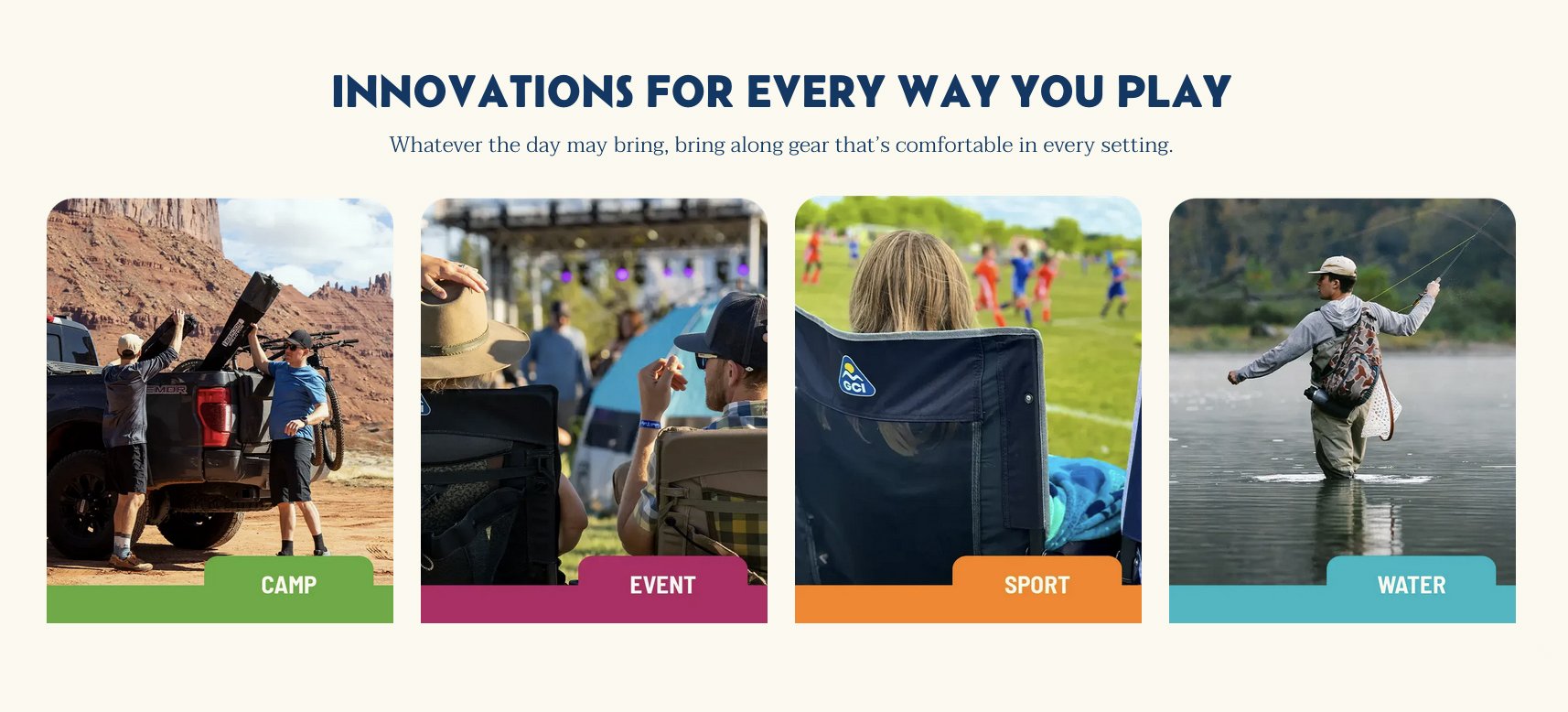
We led consumer research, built a product segmentation framework rooted in how people actually use GCI’s products, established an evergreen storytelling platform, and built a refreshed identity system to celebrate the joy of gathering outside, together.
Services
: Brand Refresh + Positioning
: Brand Strategy
: Brand Identity
: Creative & Art Direction

+36%
Website
Revenue YoY
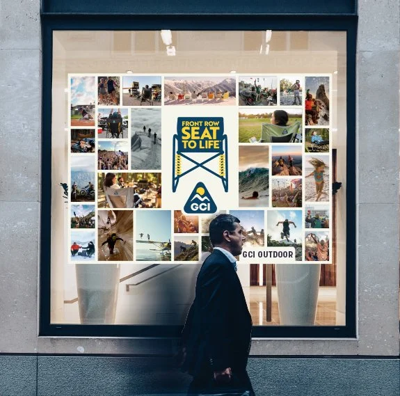
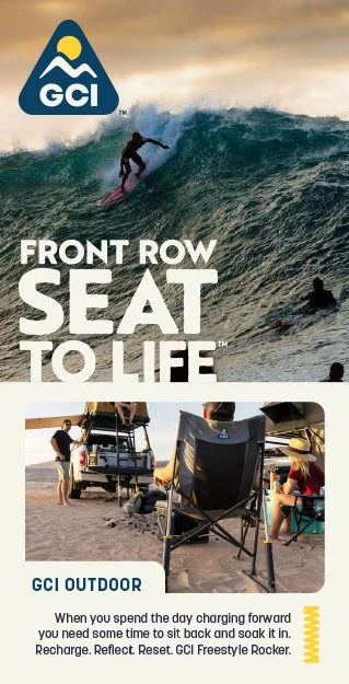
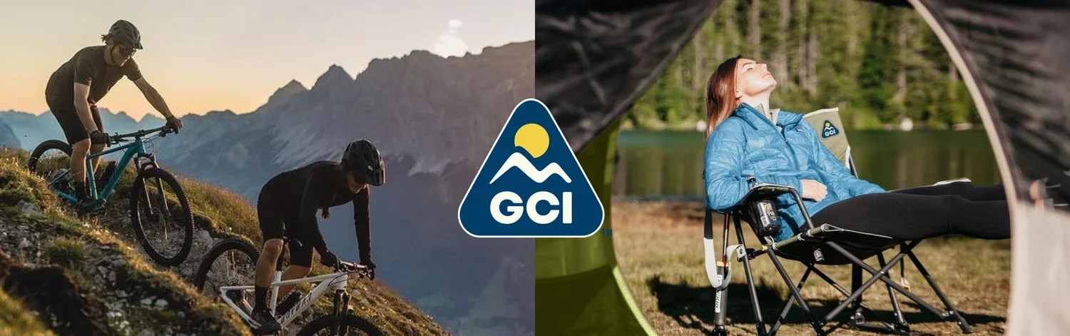
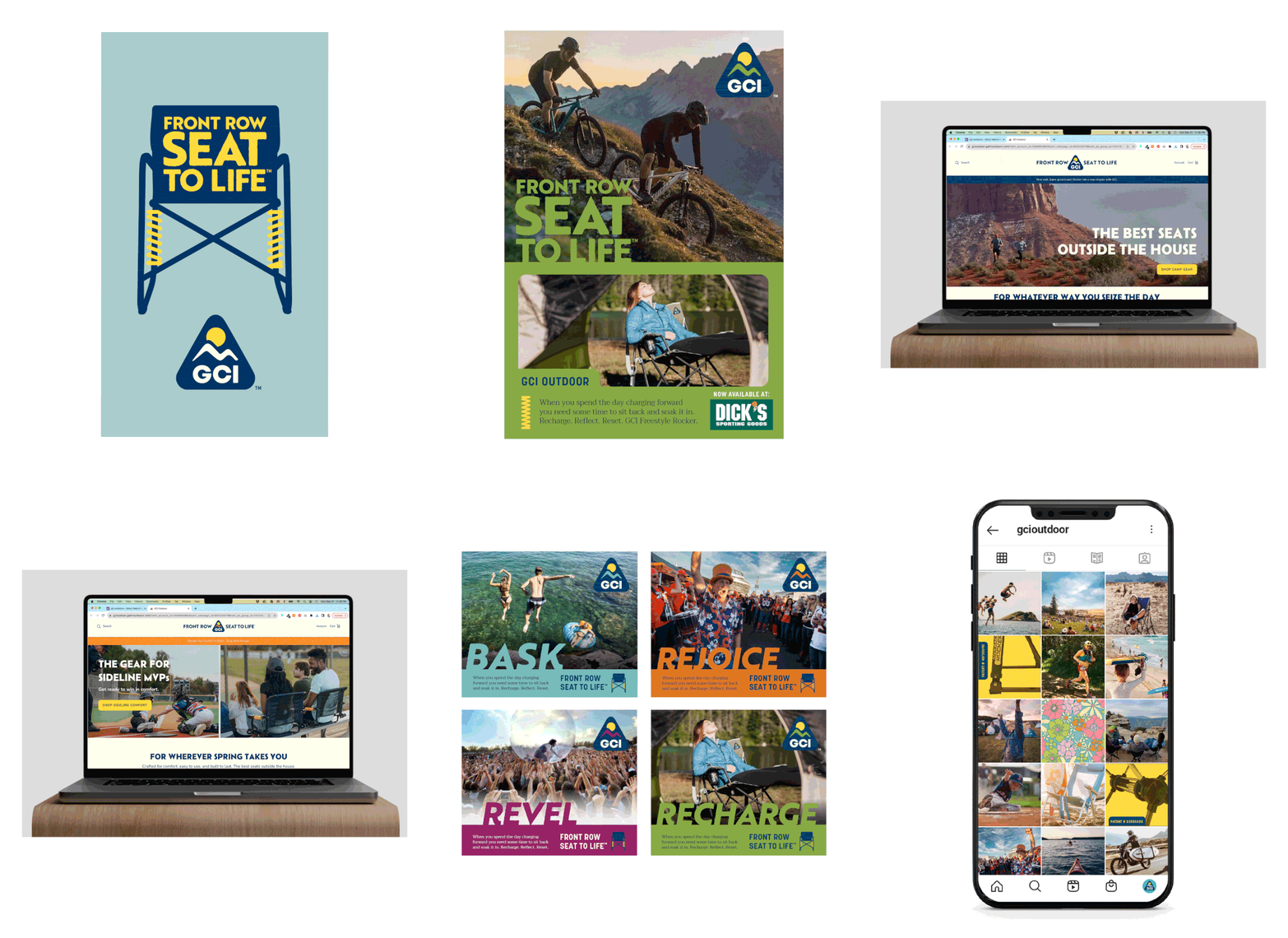
We launched Front Row Seat to Life as GCI’s new brand platform and campaign. Strategically setting the foundation for a refreshed identity and a move towards a more active and expressive brand system. We evolved and refined the logo, expanded the visual vocabulary, introduced a new typography and color system, and created visual tools to support richer storytelling, bringing the innovation of the product and the consumer experience to life across every touchpoint.
The Results
The brand work unified GCI’s expression and clarified how their product innovation showed up in real outdoor moments. By meeting consumers where they gather: the beach, concerts, tailgates, and campsites, GCI was able to deepen emotional connection, strengthen product relevance, and drive meaningful growth.

Historical Logo
The GCI Original Logo featured a sun icon and a lightning bolt to mimic the shape of the Everywhere Chair®, the product that launched the brand.
+261%
Email Revenue
After Brand Relaunch

2008-2023 Logo
This logo reflect updates to showcase the brand beyond the art of sitting — adjusting the shape of the Everywhere Chair to a mountain representative of the outdoors.
+121%
Email List
Growth

New Logo
The latest logo retains the shape and elements of the previous two logos, evolved to express the brand pillars of gathering, comfort and innovation. The edges and typeface are rounded and the historic mountain range has been adjusted to encompass the product and distribution segments of camp, water, sport and festival